
This design mistake is killing your surveys
There's a good reason why researchers increasingly avoid this survey method...

See also: 121 European User Research Tools to try in 2026 🌍🇪🇺
Straightlining is when a survey respondent gives the same score, rating, or answer to every item in a voting list — producing data that is a lot less useful for your research.
Almost every guide I found online is just fundamentally wrong about straightlining, consistently placing the blame on ‘lazy’ respondents. In doing so, they repeat the same flawed explanations and incomplete advice to researchers again and again.
This post aims to set the record straight. It covers the different contexts in which straightlining appears, why it happens, how to interpret straightlined responses correctly, and how to reduce straightlining so that it doesn’t undermine your research.
What Researchers Misunderstand About Straightlining
Open almost any guide on straightlining and you’ll see the same repeated story:
Qualtrics says “straightlining happens when your respondents rush through your survey clicking on the same response every time … because they’re bored, don’t have the mental energy, or they find the survey too complex and demanding.”
DriveResearch claims “straightlining is a dead giveaway that the respondent is uninterested, in a time crunch, or lacking the mental energy to take a survey.”
The Research Society suggests straightlining happens when “people become lazy or hasty in their responding, just to get it over with.”
Ironically, the laziest thing here is actually the repetition of this incorrect explanation.
Straightlining appears in survey data for many reasons, including respondents completing the survey perfectly legitimately. In fact, straightlining is often a predictable outcome of poor survey design choices, not respondent laziness.
I wrote this blog post to correct the record. Below are four distinct types of straightlining you may encounter in surveys, where #3 and especially #4 is routinely overlooked by most researchers.
— — —
Four Scenarios Where Straightlining Happens
Straightlining has multiple underlying causes. Some are invalid and should be excluded from analysis, others are entirely valid but often mistakenly removed due to a fundamental misunderstanding of straightlining.
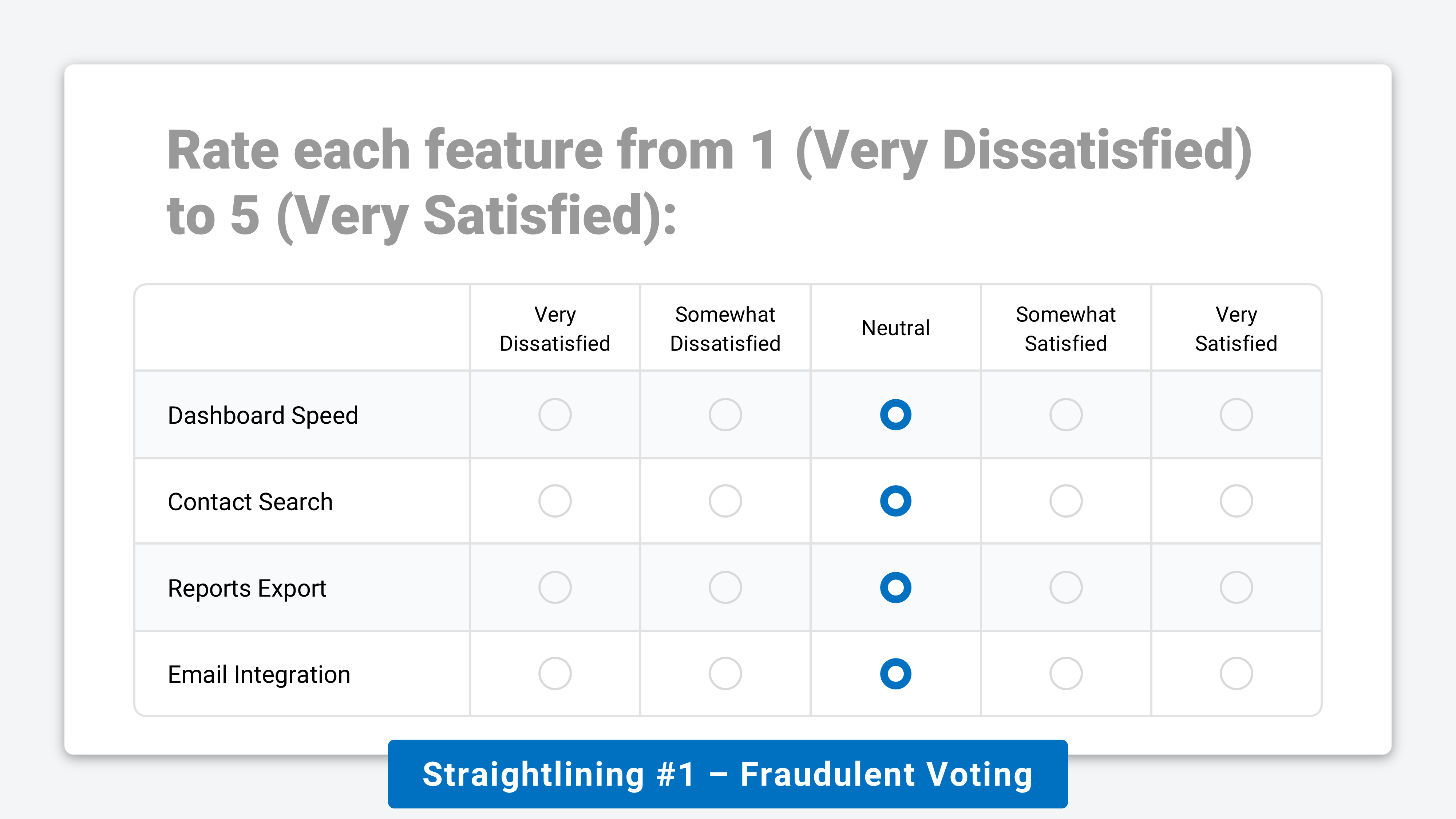
#1. Fraudulent ⚠️
This includes bots, paid cheaters, or disengaged respondents who select the same answer across every item in a grid to finish as quickly as possible, typically ignoring the content entirely.
These responses clearly damage data quality. They can often be identified by a combination of repeated identical answers (eg. selecting “3/5” for every option) and implausibly fast completion times (eg. <2 seconds per question).
Note: the screenshot above could also be an example of Central Tendency Bias, a different form of straightlining where respondents avoid the high/low ends of a scale for other reasons.
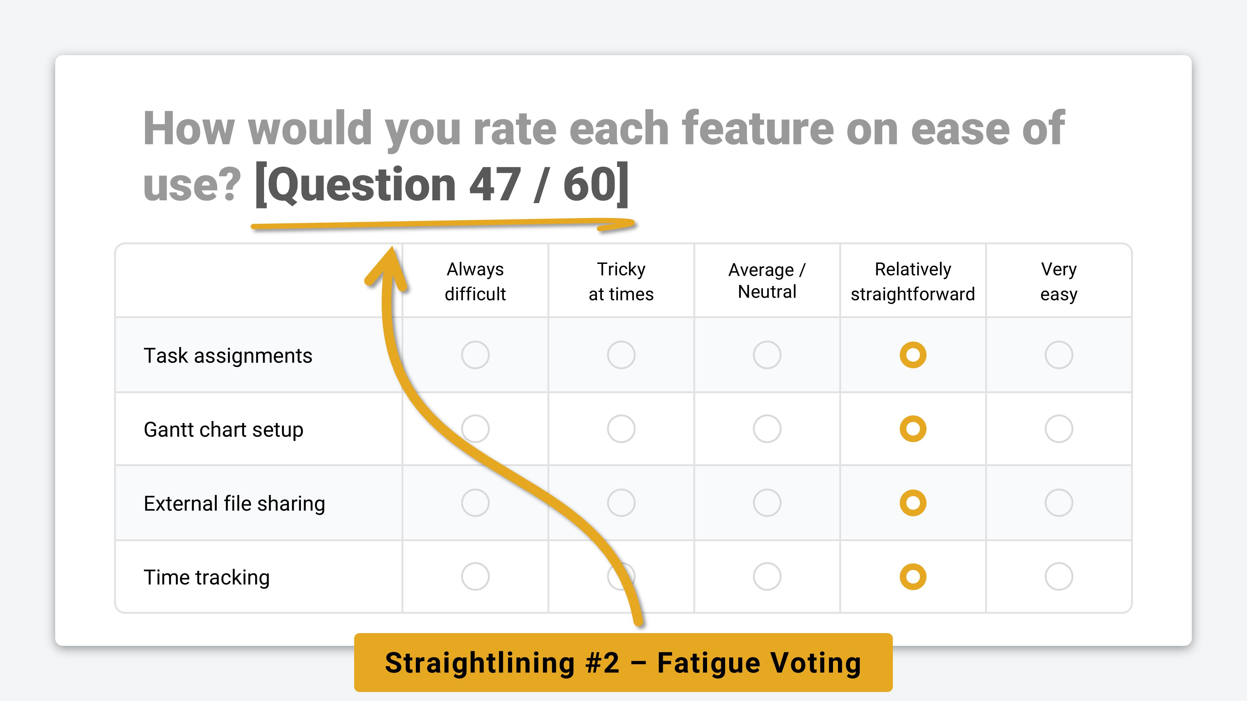
#2. Fatigue 💤
Fatigue straightlining usually comes from legitimate respondents who start the survey engaged, but run out of mental energy partway through. They switch from thoughtful responses to straightlined answers mid-survey.
This is most common in long, wordy, or glitchy surveys. It can often be reduced with clearer progress indicators, better incentives, shorter surveys, more accessible language, or cleaner design that lowers cognitive load.
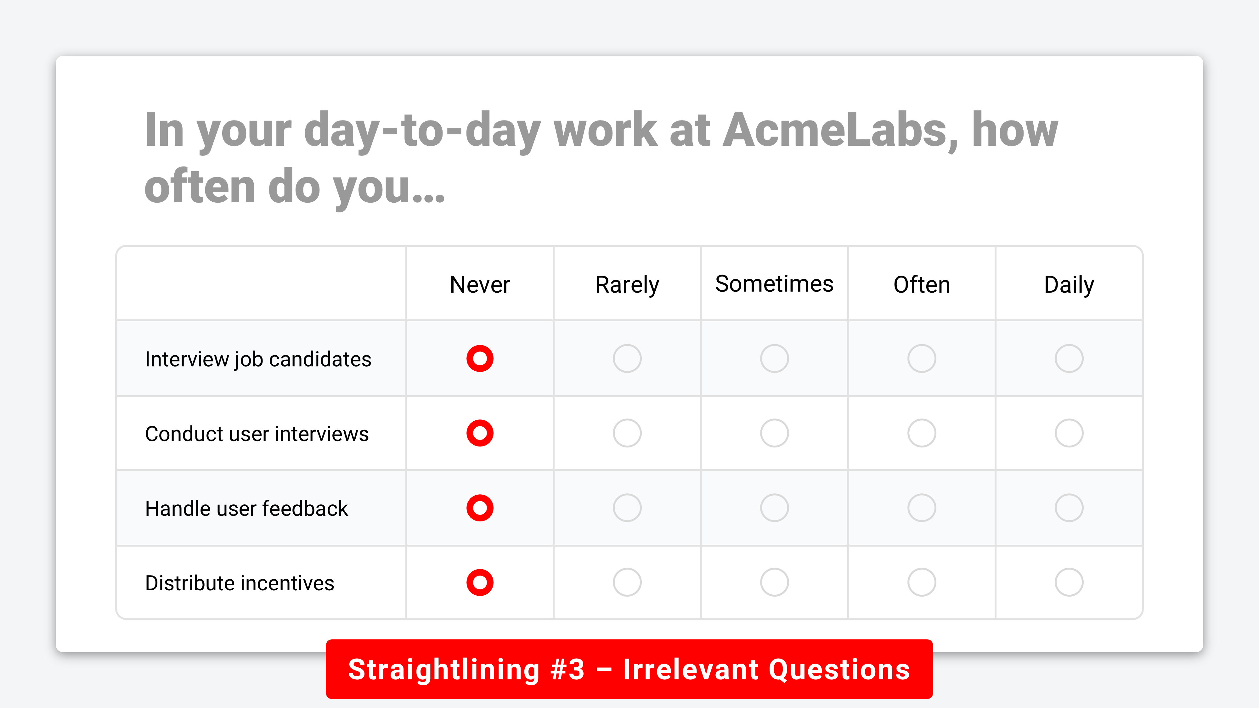
#3. Irrelevant 🤷
When respondents are asked to evaluate items that don’t apply to them, straightlining is often a perfectly rational response. In these cases, you’ll see consistent selections of options like “N/A,” “Never,” or “Neither agree nor disagree” across the entire list.
A 2020 paper published in Survey Research Methods found that these genuine straightlined responses accounted for up to 22% of answers in some surveys, and that removing them introduced negative bias in regression coefficients of 13%-39%. Irrelevant straightlining is an important counterexample to the dominant narrative that straightlining equals lazy respondents.
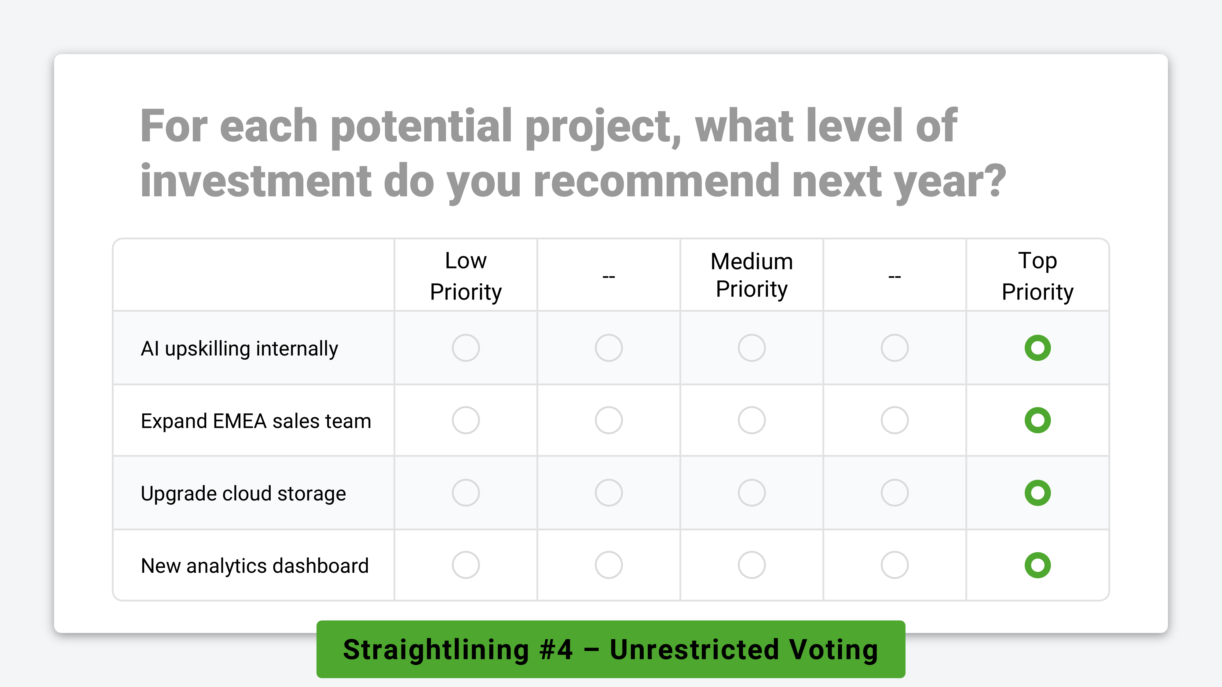
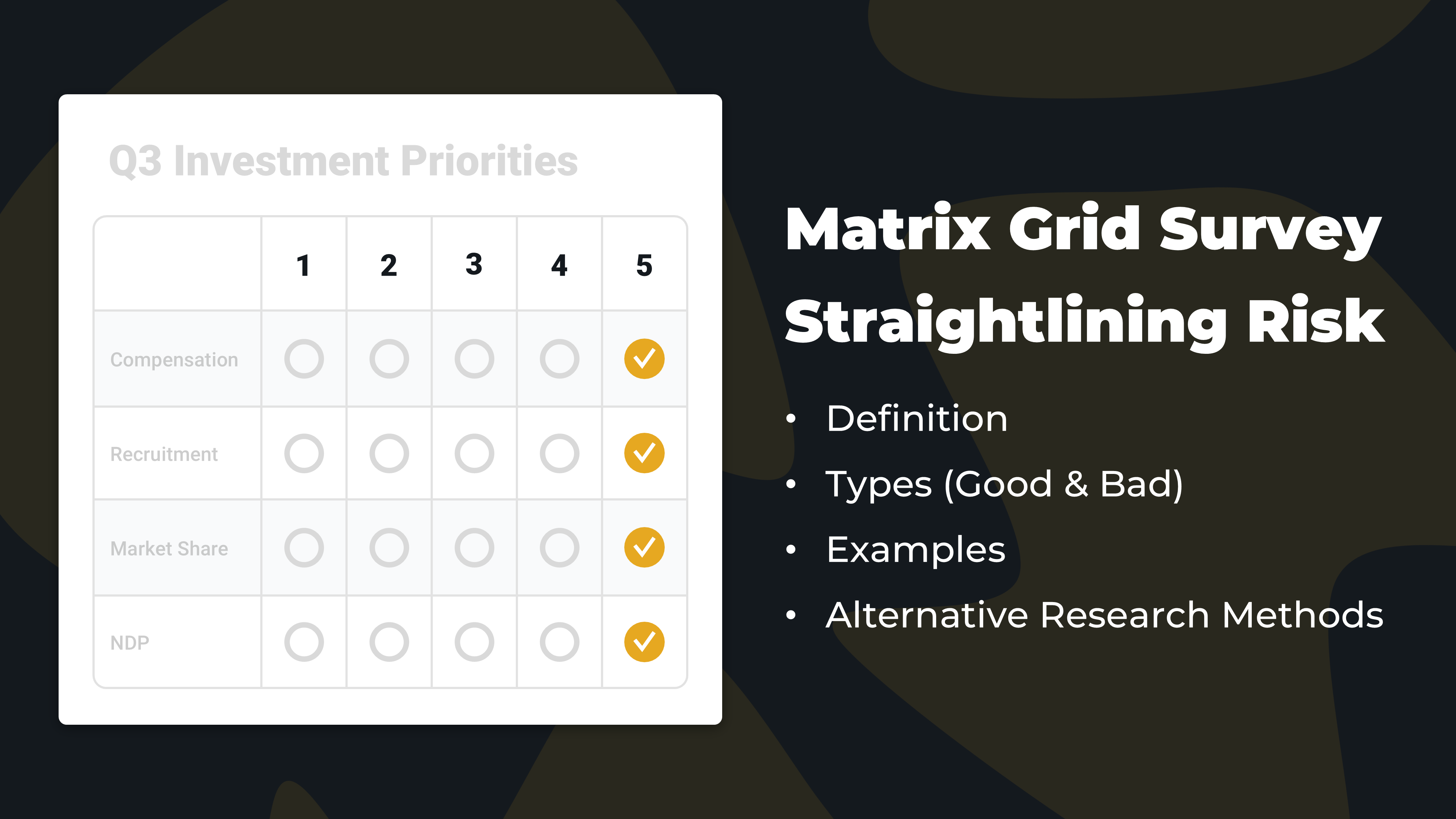
#4. Unrestricted 🤑
When respondents aren’t forced to consider trade-offs or compare options directly against one another, straightlining is a natural and expected outcome.
For example:
Employees selecting non-salary benefits in an HR survey
Customers voting on a list of problem statements in user research
Managers indicating investment priorities in a strategic planning survey
In each example above, it’s entirely reasonable for a participant to mark every option as a “top priority.” This is the form of straightlining researchers most often overlook. It isn’t caused by fraud, fatigue, or irrelevance — it’s simply a consequence of poor survey design.
Likert scales, voting grids, and matrix questions measure each option in isolation. But in reality, people operate under constraints like limited budgets, time, or resources that force them to consider trade-offs. When surveys ignore those constraints, straightlining is a predictable and rational way for respondents to vote.
— — —
Researchers Are Turning Away From Matrix Grid Questions — But To What Alternatives?
43% of online surveys in 2015 included matrix questions. By 2020, that figure had fallen to 19% and has barely changed since.
Why did matrix questions fall out of favor with researchers?
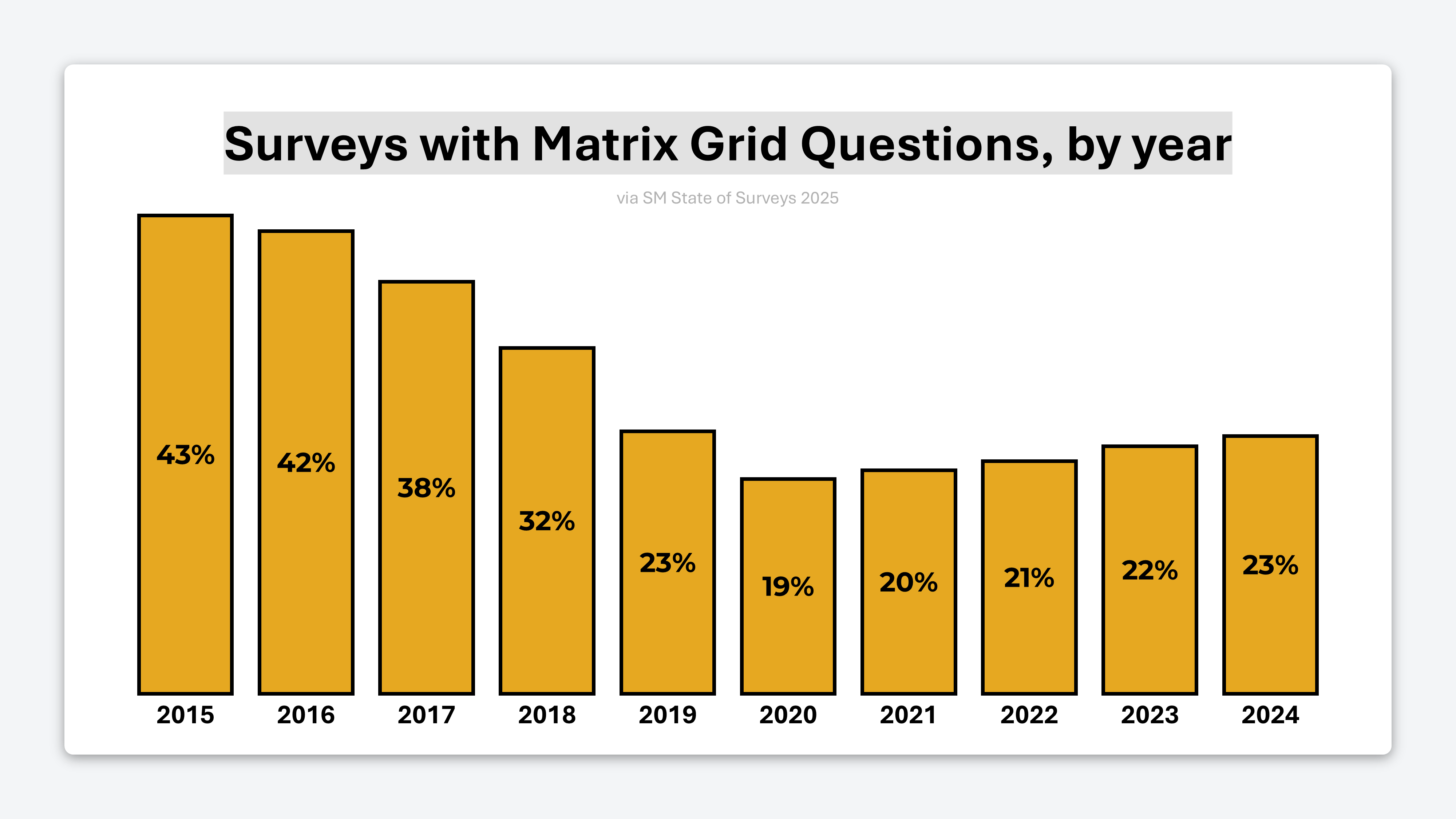
Part of the answer is straightlining. But the bigger issue is usability.
Last year, 67% of OpinionX surveys were completed on mobile devices, and matrix questions are notoriously difficult to answer on phones. Data quality issues caused by straightlining are only amplified when two-thirds of respondents are forced to scroll, pinch, and zoom just to answer a basic question.
While matrix questions may feel efficient from a researcher’s perspective, they often come at the expense of the respondent experience. The result is higher friction, lower engagement, and a greater risk of compromised results.
So if matrix grids are falling out of favor, what alternatives actually address these problems?
— — —
4 Survey Methods That Prevent Straightlining
A good alternative to matrix grid questions should meet this criteria:
Good mobile usability → Respondents shouldn’t need to pinch, zoom, or scroll in multiple directions just to read the question and vote.
Preferences require comparison → To measure what truly matters, respondents must be forced to compare options, consider trade-offs, and make decisions.
One question per screen → Presenting cognitively demanding tasks one at a time improves response quality, especially among people with low-ability or low-motivation.
So which question types meet these criteria? Here are four options…
— — —

1. Ranked Choice Voting 🥇🥈🥉
Ranked Choice Voting presents respondents with a list of options and asks them to rank them from highest to lowest preference.
While it doesn’t fully meet the “one question per screen” criteria, ranked choice works best for short list of between 3 and 10 items. Crucially, it forces explicit comparison, making straightlining impossible compared to matrix grid questions.
— — —

2. Pairwise Comparison 🆚
In a pairwise comparison survey, respondents are shown a series of head-to-head choices randomly drawn from your list of options.
This voting method is really flexible and can measure things like relative preference, importance, satisfaction, concern, and more depending on how the question is framed. Pairwise comparison meets all three criteria perfectly — it enforces comparison, breaks complexity into simple decisions, and works especially well on mobile phones.
— — —
3. MaxDiff Analysis ⬆️/⬇️
MaxDiff Analysis presents respondents with 3-6 options at a time in a series of sets and each time asks them to choose the best and worst option in the set. Like pairwise comparison, these sets are randomly compiled from your full list of options.
Like pairwise comparison, MaxDiff is a choice-based method that can be adapted to many contexts like most/least important, highest/lowest priority, etc. Unlike matrix grids, which have declined in usage of 56% from 2015, interest in MaxDiff is growing rapidly — Google searches for MaxDiff are 526% higher today than they were in 2015.
— — —

4. Conjoint Analysis 📋
Conjoint analysis is designed for situations where options belong to different categories and must be evaluated together.
For example, when choosing a streaming service, people might consider things like:
Brand: Netflix, Disney+, HBO…
Price: $11.99/month, $17.99/month, $18.49/month…
Features: ads, resolution, seats, downloadable content…
It measures which categories matter most (eg. price vs brand) and also which options within each category are preferred (eg. Netflix vs Disney+).
Conjoint analysis is commonly used to answer research questions like:
Which features are perceived as most valuable?
How sensitive are customers to price changes?
Which combination of features is most appealing?
What product configuration would outperform competitors?
This makes conjoint analysis especially powerful for product and pricing research, enabling teams to run zero-fidelity experiments and test new combinations before even building anything.
— — —
The New Methods on the Block ✨
User researchers are increasingly moving into mixed methods roles where they’re expected to be able to run advanced surveys, pricing studies, segmentation mapping, and more — all at the drop of a hat. Methods like pairwise comparison and maxdiff analysis were traditionally considered “advanced market research” and gatekept from most researchers in expensive, complex platforms. That’s no longer the case.
Before you get a request for a study like this, take the time to familiarise yourself with these survey methods. OpinionX has a free sample survey gallery with interactive examples of setup, voting, and analysis dashboards for these research methods. Give them a try and comment below if you have questions that I can help answer :)
~ Daniel
The "unrestricted" category is probably the most overlooked one in practice. I've seen so many stakeholder requests for matrix grids becuase they seem efficient from the research side, but then the data ends up being pretty useless when everyone ranks everything as top priority. The shift away from matrix questions towards pairwise/MaxDiff makes alot of sense once you factor in both mobile usability and forcing actual tradeoffs.
Good Call daniel, interesting read. I have always said that straightlining is not a respondent problem but a survey problem, with the exception of bots. What I would add to the list explicitly is the most common problem in my experience: Poor question design i.e. the questions are poorly articulated, so the user has to think too much and gets tired, or they just don't make sense.
Great to see OpinionX making its mark out there!