Opportunity Gaps
A data-driven formula for finding needles in your giant haystack of user feedback, feature ideas, and discovery insights.
Most user research projects start with a broad “discovery” phase to figure out how your customers see the world and what pains, needs, and desires they have. Using interviews and focus groups for this discovery research tends to produce heeeeeaps of raw data. Finding interesting insights in this data isn’t usually the biggest challenge — it’s way more difficult to figure out which opportunities are worth prioritizing first.
Opportunity Gap Surveys identify which discovery research insights have the highest potential for impact by measuring how important each need is to your users and comparing that against how satisfied those same users are with their current solutions. The name comes from this comparison — finding the gap between importance and satisfaction allows you to spot opportunities that are very important to your customers but poorly served today.
Opportunity gap surveys are a flexible method that can be used in a wide range of scenarios, from customer discovery and roadmap prioritization to internal brainstorming and team polling, making it a valuable framework to have in your research toolkit.
This guide covers:
When to use opportunity gap surveys
How to design an opportunity gap survey
How to analyze opportunity gap survey results
How to use your results to inform product strategy
Let’s jump in…
When To Use Opportunity Gap Surveys?
The Opportunity Gap survey is fundamentally a prioritization exercise. Rather than everyone using opinions and anecdotes to argue for what they believe should be prioritized, the opportunity gap survey helps to center the conversation around objective customer data and align your team around a shared understanding of how you make decisions in situations where hard data is scarce.
The two most common times that teams will use Opportunity Gap surveys are during (1) discovery research or (2) roadmap planning.
~
Discovery research tends to follow a three-part process (ie. The Discovery Sandwich).
Broad Discovery → Uncover as many insights as possible about customers’ needs, pains, and desires.
Prioritization → Shortlist these needs by identifying which ones have the most impact potential ⭐
Deep Dive → Learn as much as you can about the context of the top-ranked priorities, like when they occur, to who, how often, at what cost, the current solutions used, why those fall short, etc.
The opportunity gap survey works well in the middle of this sandwich, giving you quantitative data to inform how you prioritize the list of insights uncovered during broad discovery research.
This prioritization step also fits into roadmap planning in a similar way…
Overall Strategy → Align the team behind the current company objectives and product goals.
Fact Finding → Gather customer feedback, usage data, research findings, and internal suggestions.
Prioritization → Create a shortlist of projects to prioritize in the coming month / quarter / year ⭐
In both scenarios, you start with mostly qualitative insights and the Opportunity Gap Survey helps you figure out which to focus on by adding quantitative data to the discussion. Even outside of discovery research or roadmap prioritization, if your scenario meets this basic premise, you’ll find that some version of the opportunity gap survey will likely work great for you too.
How Do You Design An Opportunity Gap Survey?
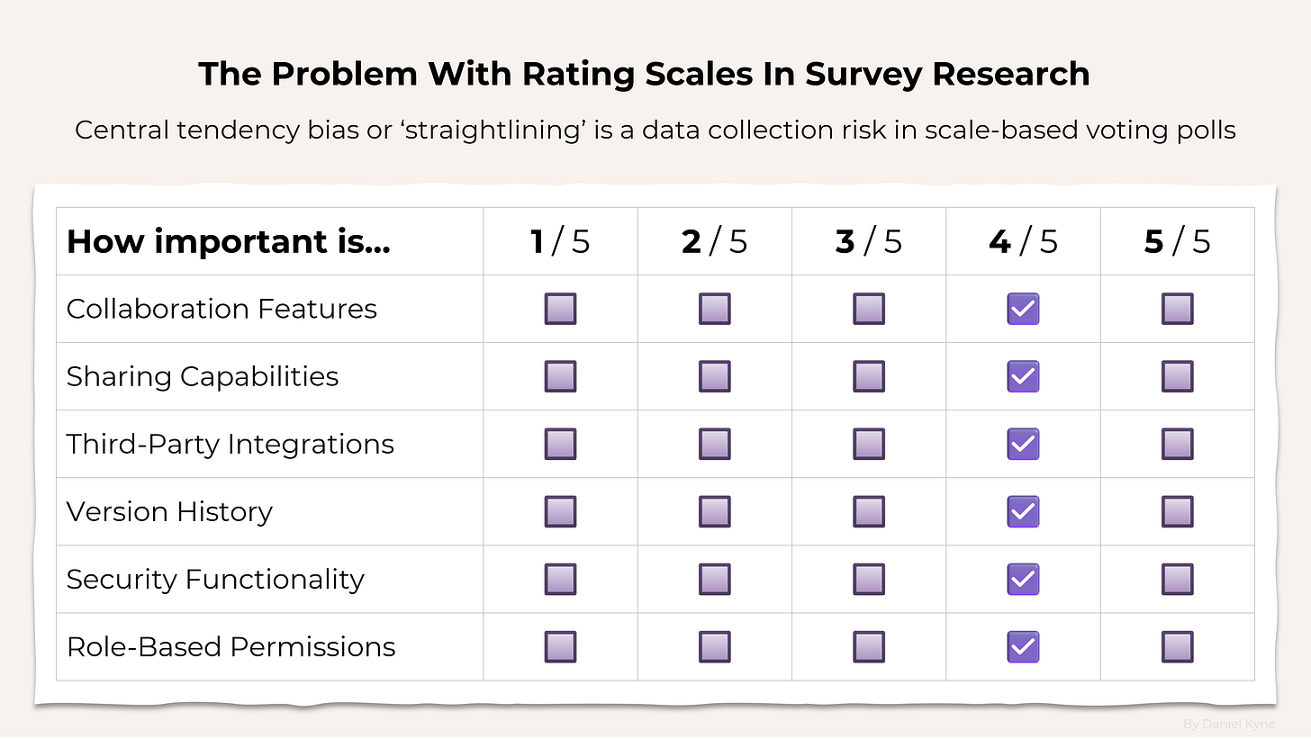
Usually, opportunity gap surveys are designed using rating scale questions where each option is shown with a 1-5 point rating scale, first time around for importance and then a second time for satisfaction.
I would strongly recommend against using rating scale questions in your Opportunity Gap survey for the following reasons:
1. Forced Shortlisting: The whole point of using an Opportunity Gap Survey is to avoid prioritizing your list of options based on untested assumptions. Rating scale surveys generally require every respondent to vote on all possible options. If you have a bunch of options you want to include, your survey will end up being unfeasibly long, forcing you to shortlist the options yourself beforehand. For example, this guide by The User Research Strategist recommends using the RICE prioritization framework to shortlist your insights before creating your survey, but that sort of pre-research shortlisting is exactly what we want to avoid!
2. Straightlining: Rating scale questions are one of the most likely survey methods to suffer from a data collection problem called straightlining, where a participant gives every option the same score. Straightlining creates low-quality survey results and generally just wastes everyone’s time. Better methods use forced comparison survey methods that reveal people’s preferences by forcing them to directly compare options against each other.
3. Scale Interpretation: What does a 4/5 on a 5-point rating scale actually mean? Something different for everybody! Adding text labels for each question will help to normalize interpretation to some degree, but fundamentally this is not a consistent approach to measuring importance.
4. Repetition: Completing a survey with 20 or more rating scale questions is extremely boring. I wouldn’t wish that on anybody — especially not my high-value customers.
Instead of using rating scales, opportunity gap surveys are better suited to comparison-based ranking methods like Pairwise Comparison or MaxDiff Analysis. Here’s how they work…
Pairwise Comparison → turns your list of options into a series of head-to-head votes and ranks them based on the percentage of votes they are picked as the “winner.”

MaxDiff Analysis → turns your list of options into a series of voting sets where 3-6 options are shown and respondents are asked to pick the best and worst option from each set.
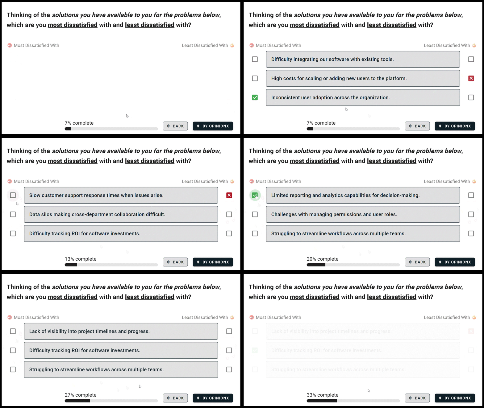
Both of these survey methods are far superior to rating scales for measuring relative importance. Everyone interprets the options in the same way (ie. “this one or that one” rather than “is this a 4/5 or a 5/5”). They can take much longer lists of options and show each respondent just a sample of the total list, meaning you don’t have to artificially shortlist your list of options based on flawed assumptions. And comparison-based voting is far more similar to how people make decisions in everyday life; by comparing options and choosing the ones that matter most to them.
If the options you’re using for voting are concise and easy to understand, I would use MaxDiff Analysis as it allows you to gather more data faster by showing 3-6 options per voting set. For more complex or longer ranking options, I would use Pairwise Comparison. By only showing two options at a time, it is much easier for respondents to consider each vote more realistically.
Before actually drafting the survey though, you’ll need to clarify what specifically your opportunity gap survey will measure. To ensure that each respondent completes your survey with the same context, you should set a clear perspective for how they should evaluate each option for importance and satisfaction. Here are some examples of the framing you could choose for your survey:
Unmet Needs → Identify gaps that prevent users from accomplishing their goals.
Pain Points → Highlight frustrations and obstacles faced when trying to succeed.
Risks and Concerns → Explore uncertainties deterring user from trusting you.
Process Priority → Compare routine activities to see which is highest importance.
Alternative Solutions → Analyze competing products to see where they fall short.
Existing Features → Evaluate the effectiveness of your product’s current features.
Prospective Functionality → Judge desire for hypothetical product capabilities.
Values and Principles → Measure core beliefs driving users’ motivations / actions.
Personal Preferences → See how tastes shape people’s perception of your product.
Choosing Pain Points as the framing for my survey, here’s how I would write the two pairwise comparison questions for my opportunity gap survey:
Which of these problems do you feel is more important to address in order to improve your work?
Which of these problems do you feel less satisfied with in terms of the solutions available to you?
Next I’ll create a survey with two pairwise comparison sections on my survey (you can create unlimited pairwise surveys with unlimited participants for free on OpinionX). For both of these “sections”, I’ll paste in my list of problem statements. For help with this step, I recommend two of my previous guides on brainstorming problem statements and how to write problem statements for user research.
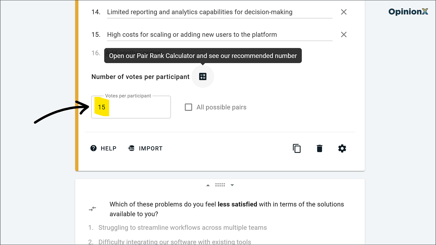
For each of the pairwise comparison blocks, I’ll set my survey to show 15 pair votes for each participant, meaning that overall they will be asked to vote 30 times in the survey. If you have a limited number of participants, use the built-in calculator to see the recommended number of votes per person. Here’s how that setup looks on OpinionX:
Other than these two pair voting sections, I’d recommend adding two other question types to the end of your survey → (1) an optional email collection step and (2) some multiple-choice questions at the end to bucket respondents into customer segments based on categories like pricing plan or country (this data will be important later on!).
How To Analyze Opportunity Gap Survey Results
Pairwise comparison results are on a scale from 0 to 100 where 0 means the option won 0% of its pair votes (ie. very low importance) and 100 means it won every pair vote. This analysis is calculated automatically on OpinionX after you’ve run your survey and will look like this:
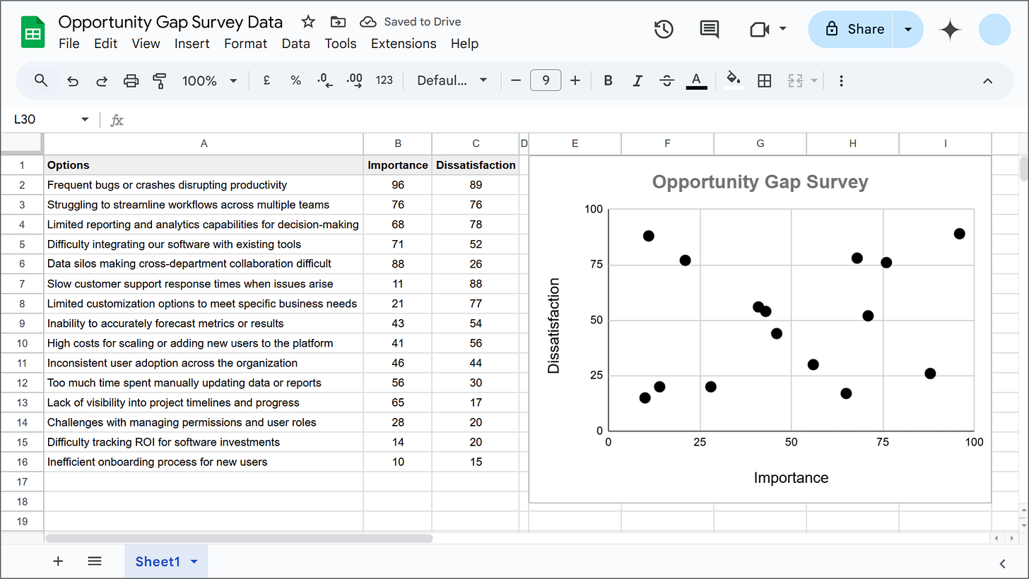
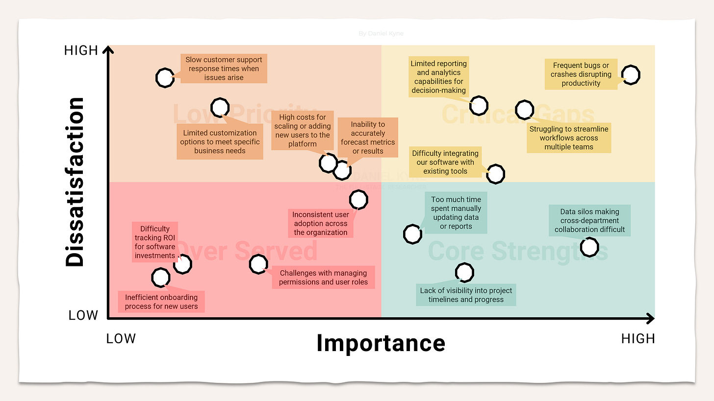
All you need to do is create a simple table of results on Google Sheets with the text options in column A and then the scores from your importance and dissatisfaction pairwise comparison results in columns B and C. Highlight this table on Google Sheets and choose Insert → Chart → Scatter Chart. Your GSheet should look something like the scatterplot below, with importance on the x-axis and dissatisfaction on the y-axis:
To turn this table into a ✨prettier✨ scatterplot, I exported the chart as a PNG from Google Sheets in 16:9 ratio with a transparent background (Chart Editor → Customize → Chart Style → Background Color → None) and used that to quickly recreate it on PowerPoint instead:
There are two types of opportunities that this graph helps us to identify…
A. Turn Critical Gaps into Core Strengths → build better solutions that reduce customer dissatisfaction with the status quo.
B. Identify Low Priorities that are Critical Gaps to key customers → filter your results to find customer segments that say an otherwise low-priority problem is of high importance to them.
Using your Opportunity Gap results to inform product strategy
Ok… but how do you actually take advantage of these two opportunity types? What specific methods can you use to move these problems into the “core strengths” area? Here are three great techniques to keep in mind…
A. Opportunity Solution Trees
To move problems that fall in the Critical Gaps category (ie. high importance and high dissatisfaction) to the Core Strengths category, you need to reduce customer dissatisfaction by building better solutions than the options currently available to them. When you have a clearly identified problem like this, the best approach for finding the right solution is called the Opportunity-Solution Tree.
The Opportunity-Solution Tree (by Teresa Torres) is a structured approach to brainstorming solutions in product management. Outcome is the goal that the company or team is working to accomplish (eg. increase retention, improve activation, strengthen organic referral), although I sometimes like to reframe this as a customer-focused outcome like a task or “job” they are trying to accomplish (eg. run high-quality end of year reviews with my direct reports, or decide what to prioritize for the product roadmap next quarter).
The Opportunity section is typically a customer’s need, pain, or desire — in my example, it is the problem statement that was categorized as a Critical Gap in our pairwise comparison survey. Solutions are all the various ways that this problem could be addressed in a way that makes progress towards the parent Outcome as set out at the top of the tree. Each solution should have a number of experiments that will help de-risk the solution as the right way to tackle the opportunity above it. Here’s an example of one branch on an Opportunity-Solution Tree, showing the various options that were excluded at each node along the way:
Opportunity-Solution Trees are a great mental model for considering and mapping all your options before jumping right into solution mode, as well as helping contextualize the whole process with the overall outcome that you’re trying to accomplish. Following this approach, you’ll identify a range of potential solutions to address your Critical Gap customer problems and the experiments you can use to test whether these solutions will deliver the results you need.
~
B. Segmented Crosstabs
What if your survey didn’t result in many problems being categorized as Critical Gaps? It’s very likely that some problems classified as Low Priorities overall are actually of high importance for certain subgroups of your total customer base. Here’s how to find those customers…
A segmented crosstab is a table where each row shows one ranking option from your pairwise survey and each column represents one customer segment. Where a column and row meet, you’ll find the pairwise score that one customer segment gave to a specific problem statement. If you’re already terrified about the prospect of putting these reports together, stop worrying! OpinionX’s Segments Tab feature automatically turns your survey results into these crosstab tables and adds color coding to help you quickly spot problems that got the highest importance or dissatisfaction scores.
Start by picking out the problem statements that have a high dissatisfaction score overall, find that problem statement on the crosstab, and look across that row to see if any segment of respondents scored it considerably higher in importance than the average score. Once you’ve identified a segment with a high importance score, you should use an Opportunity-Solution Tree to plan out how to move this problem from a Critical Gap to a Core Strength for that customer segment.
Above is an example of a segmented crosstab for ranked results. Three segments are shown on the right-side columns based on how people voted in an NPS survey. The five rows include the options that were ranked by survey participants. We can immediately see a big difference between what each segment cares about — for example, the “detractors” segment in the screenshot above gave the “streamline workflows” a much higher score than everyone else (note the dark blue cell with a score of 71). OpinionX’s Segments Tab lets you load up to 25 segments as columns and display up to 50 rows of ranking options together in one table, helping you to quickly see which segments from your Opportunity Gap Survey hold outlier opinions.
~
C. In-Depth Interviews
Before jumping into solution brainstorming, it’s vital you first understand why customers ranked these problems so high in importance and what makes their existing solutions so dissatisfactory. The best way to do this is through in-depth interviews.
Thankfully, if you asked for an identifier in the survey like respondents’ email addresses or enriched your survey beforehand with data from your CRM, then you can filter the results to find someone that matches your exact criteria — like what customer segment they belong to and how high their pairwise scores were for a specific problem statement.
OpinionX’s Participants Tab shows you the survey data for all respondents in one giant table along with analysis features for searching, sorting, and segmenting to find the perfect person to invite for a one-on-one interview.
Getting started with your first Opportunity Gap Survey…
Everything I’ve covered in this guide can be done for free on OpinionX. Create your own opportunity gap survey to measure your customers’ perceived importance and solution dissatisfaction by using OpinionX’s free comparison-based voting methods like pairwise comparison and maxdiff analysis.
Hope you found this guide useful! I’m excited to share a series of pricing research guides over the coming weeks that I’ve been working on recently. If you have any hot topics you’d like to see covered in that pricing series, hit reply or leave a comment and let me know :)
— Daniel







Really amazing guide, Daniel! Would this tactic work for a low sample size? Say, 20 or fewer respondents?