
My Cheat Sheet for Measuring User Preferences
Whenever someone asks, “What’s the best research approach?”, I turn to these four questions to help them pick the right method.

This post is brought to you by Attio -- the AI-native CRM built to scale your company from seed stage to category leader. Powerful, flexible, and intuitive to use, Attio is the CRM for the next-generation of teams. Start for free today.

Picking the wrong research method to measure your users’ preferences can easily derail your entire project…
I’ve helped hundreds of product researchers design projects that measure which features users value most, which ideas people prefer most, or which problems customers are most urgently trying to solve.
Even for researchers with years of experience, it can be difficult to decide which method is most suitable when choosing between advanced survey formats like conjoint analysis, maxdiff analysis, and pairwise comparison.
No need to worry -- here are the four simple questions I use to match the right survey format to each research project’s unique requirements…

Top 5 Research Methods for Measuring User Preferences
Before jumping into my cheat sheet questions, it’s worth briefly clarifying what research methods are used most often for measuring users’ preferences. Here are the five most common approaches:
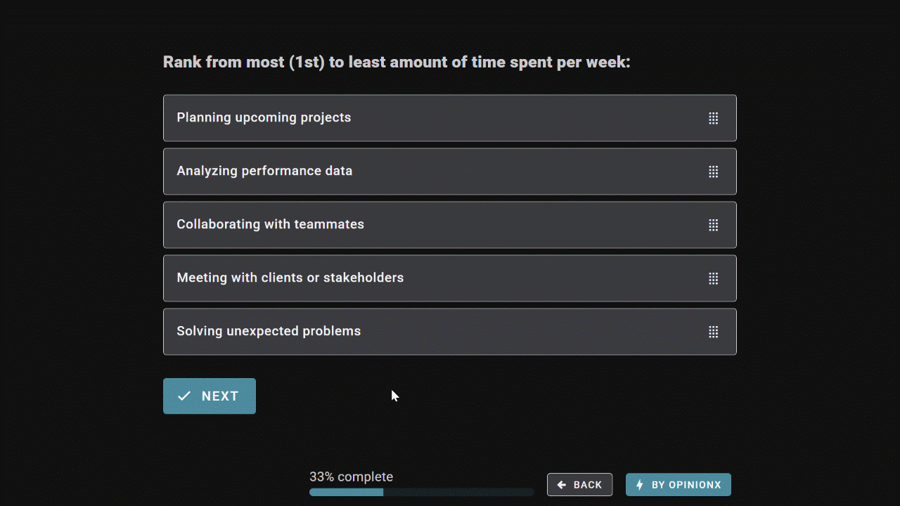
Order Ranking
Points Allocation
MaxDiff Analysis
Pairwise Comparison
Conjoint Analysis
Each of these methods follows the principle of forced trade-offs -- instead of letting people rate each option individually on a scale from 1-10 (where they can just rate everything as 7/10 🙄), people are forced to choose between options that appear in comparison sets.
By adding everyone’s choices together, you get a relative importance score for each option, like this:

Ok, let’s jump into the four questions…
— — —
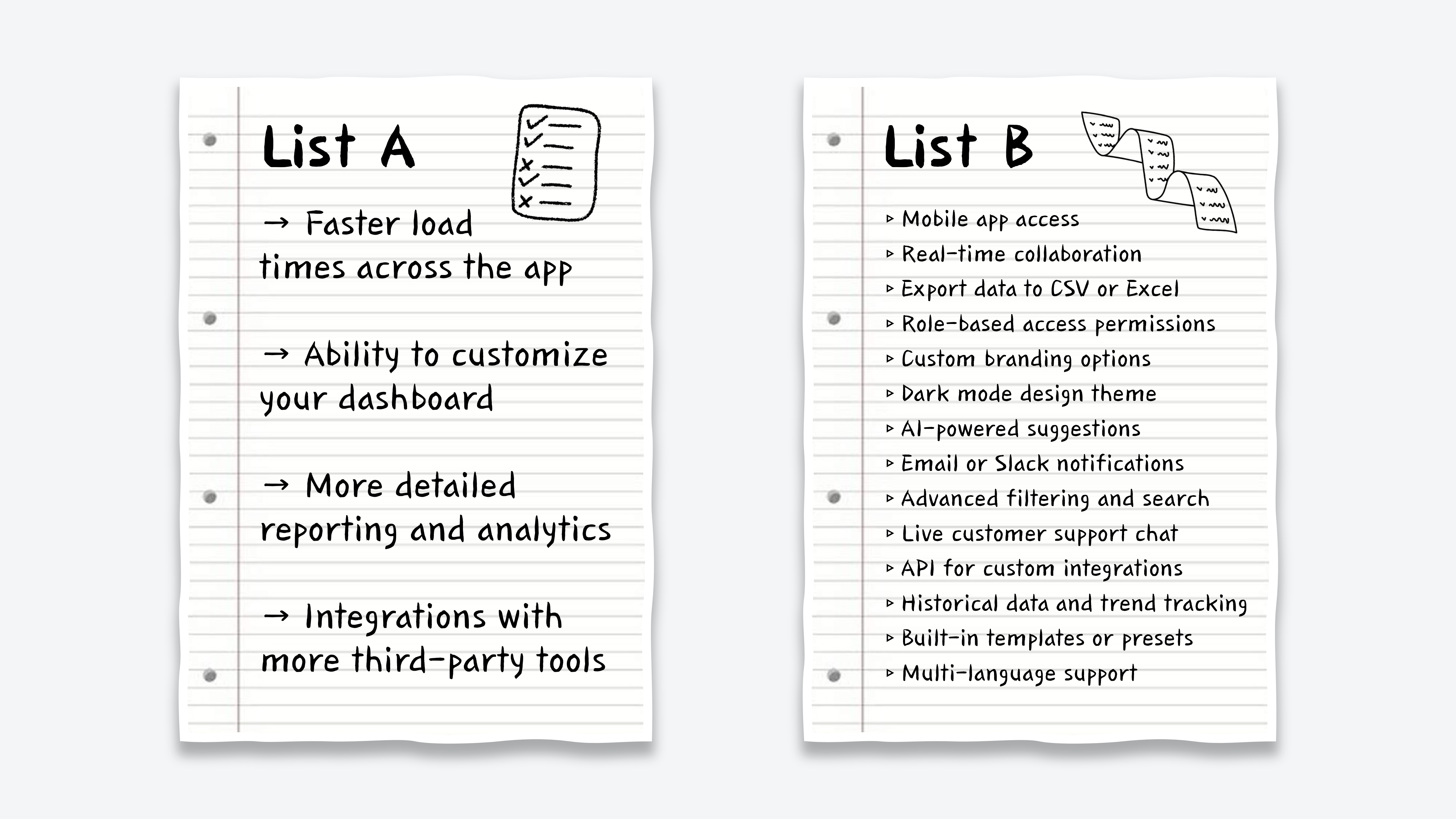
Q1. Single List or Categories?
Are you ranking a simple list of options or do your options belong to separate categories?

The ice cream flavors in List A can easily be compared and ranked against each other because they all belong to the same category. If your list of ranking options looks like this, jump ahead to Q2.
The options in List B are choices you would consider when buying a new car, but the options in this list aren’t so easy to compare directly against each other. While we could vote on whether car color or car brand is more important to us, this list is asking us to compare stuff like Blue -vs- Ford which is much harder because these options belong to separate categories. Even more importantly, every car must have a color and a brand, so comparing options across categories like this is counterproductive.
If your list of ranking options looks more like a list with multiple required categories like in List B above, then you should use Conjoint Analysis as your survey method…

Conjoint Analysis is a survey format designed for ranking options that belong to multiple categories. It shows sets of 2-6 profiles, where profiles all share the same categories but each profile shows different options within those categories (eg. Blue Gas-Powered Ford vs Black Electric Tesla). By randomizing the options shown on these profiles after each vote, we can see which categories are most important and which options are most preferred within each category.
— — —
Q2. List Length?
How many options are you trying to compare and rank?
If you’re only ranking a short list of 3-10 options, like in List A, then continue on to Q3. If you’re trying to rank a list that contains more than 10 options, like List B, then jump ahead to Q4.
— — —
Q3. Equal or Skewed Input?
Should everyone have an equal say in picking one winner or should stronger opinions carry more weight?
Since your list only includes 3–10 items, it’s short enough for participants to evaluate the whole list without it being overwhelming for them. That leaves you with two voting methods → Order Ranking and Points Allocation.
Order Ranking asks respondents to rank the entire list from most to least preferred, producing a clean list of priorities without ties in each person’s ranking. It captures relative position of preference -- ie. what comes first, second, third, etc for each person. Since everyone’s rankings are treated equally, Order Ranking is ideal when your goal is to choose a single winner.
Points Allocation gives respondents a pool of points to distribute freely across your list of options. It captures the relative weight of preference -- ie. not just which options people prefer, but how much they care about each one. Points Allocation lets participants emphasize what matters most and skip what doesn’t, making it better suited to situations where you’re picking multiple winners.

Here’s an example to help demonstrate these differences…

List A is testing potential podcast names. I’m looking for the single best option and I want everyone’s input to be weighed equally. By forcing a consistent voting format for each respondent, Order Ranking will do a better job of surfacing the most broadly appealing name.
List B is evaluating customer pain points to help prioritize our product roadmap. Here, I want to identify spikey problems that elicit strong opinions from people, even if that comes from a small segment of customers shouting loudly about a subset of options. Points Allocation is more suitable because it lets respondents skip irrelevant issues and throw more weight behind what really matters to them. Since we’ll be choosing the 2-3 top-ranked problems to investigate further, I care less about giving everyone equal input and more about where opinions are loudest.
— — —
Q4. Complex Options?
How easy is it for participants to quickly understand each of your ranking options?
When your ranking list has more than 10 options, showing them all on screen at the same time can become an overwhelming task for people. Have you ever tried to rank a list of 20 options on a mobile phone? It’s not fun.
Almost 60% of surveys are completed on phone screens today. That’s a key reason why Matrix Grid questions have almost entirely disappeared from online surveys; down from almost 50% of all surveys in 2015 to just 19% of surveys in 2020. There are a lot of easier ways to collect ranked preferences for long lists via mobile phones. Let’s look at two.
Pairwise Comparison shows your list of options as a series of head-to-head votes. In a pairwise comparison survey, options are given a preference score based on the percentage of pairs they’re picked as the winning choice.

MaxDiff Analysis shows 3-6 options at a time and asks respondents to pick the ‘best’ and ‘worst’ options in each set. By subtracting the percentage of bests from worsts, MaxDiff Analysis surveys automatically rank the list of options by overall preference.
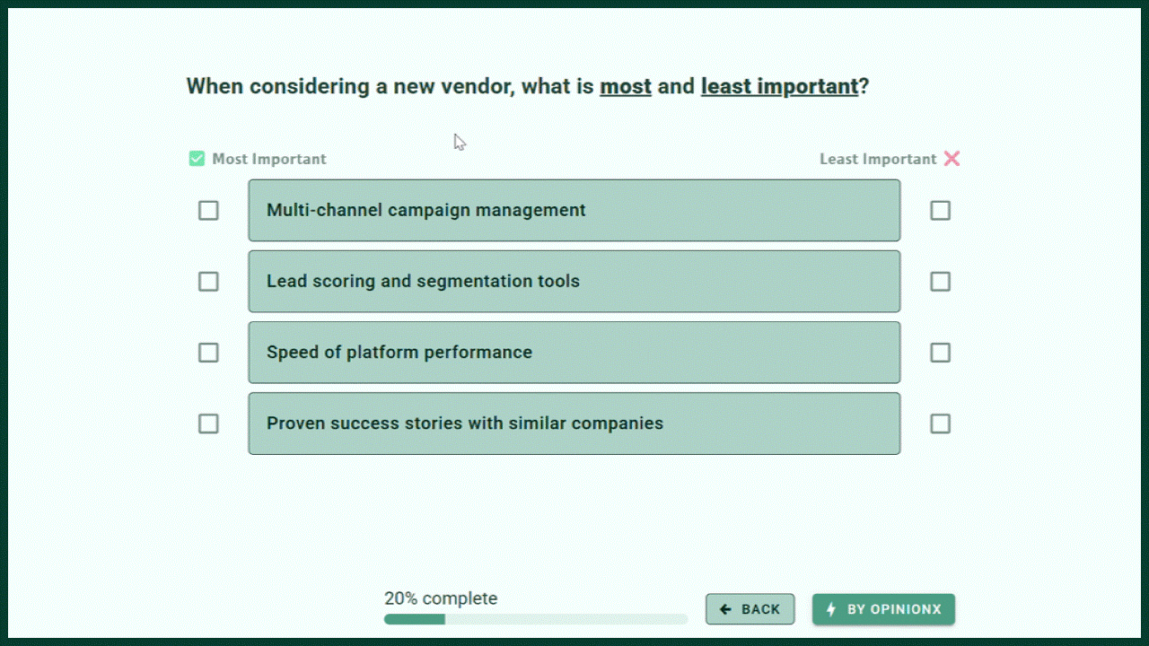
Both of these research methods are excellent for ranking long lists of options. They’re both flexible and can be tailored to various use cases by rewording the question or voting labels -- for example, change ‘best’ and ‘worst’ on MaxDiff Analysis to ‘Most Important’ and ‘Least Important’.
However, I don’t use Pairwise Comparison and MaxDiff Analysis completely interchangeably -- here are some ways to determine which format is a better fit for each individual survey…
i. Complexity
Are you ranking short statements that can be understood at a glance? Showing 3-6 long complex statements on screen multiple times in a row can be overwhelming, which makes MaxDiff Analysis a poor fit. For longer complex statements, I generally prefer to keep things simple and tidy by choosing Pairwise Comparison instead.
ii. Population
How many people are available to complete your survey? If you’re participant constrained with a small group of voters, then MaxDiff Analysis is the better option -- it gathers preference data much faster than Pairwise Comparison by showing 3-6 options per set instead of just 2.
iii. Perspective
MaxDiff Analysis balances ‘best’ and ‘worst’ votes to calculate a preference score for each option. But sometimes, I’m not interested in ‘worst’ votes at all -- if I’m ranking problem statements, I’m only interested in knowing which problems people are most frustrated by and I don’t care which ones they consider low priority. MaxDiff Analysis balances people’s perspectives, while Pairwise Comparison focuses solely on your ranking criteria. Choose accordingly!
— — —
With these four questions, you’ll be able to pick the right survey method for measuring your users’ preferences and priorities:

Once you’ve picked your survey method, plan ahead for segmentation → you don’t just want to know what users prefer most overall, you need to know which types of users care A LOT more about specific problems / ideas compared to everyone else.
To do that effectively, you should either pull your existing user info into your research platform as enrichment data (eg. from sources like your CRM), or include multiple-choice questions in your survey to get users to self-allocate into segments.
With that data, you can put your results into a crosstab -- ie. a heatmap table that shows the scores for up to 30 segments side-by-side, helping you spot outlier strong opinions at a glance.
You’re not just building your product for everyone — you’re building it for the users that care most about the problem your product solves. Use segmentation to isolate those users and sharpen your focus on the customers that matter most to you.
— Daniel
Thanks again to Attio for sponsoring today’s newsletter. By syncing your email and calendar, Attio instantly builds your CRM -- enriching every company, contact, and interaction with actionable insights in seconds.
With Attio, AI isn’t just a feature -- it’s the foundation.
Instantly find and route leads with research agents
Get real-time AI insights during customer conversations
Build AI automations for your most complex workflows
Join fast growing teams like Flatfile, Replicate, Modal, and more. Start for free today.

While all these are important tools, they all also require a high level of engagement with the questions, and unfortunately, that is increasingly rare. And when you can't assure engagement, the most elegant tool ends up with worthless response data.
I find that to maintain engagement and still work through complex lists, a simple scale assessment of each choice still provides adequate analysis data. Occasionally, 2 simple scale assessments are needed, but that again requires more engagement.